Professor Thomas Piketty’s Capital in the 21st Century has data on wealth inequality at its core. His data collection has been universally praised. Prof Piketty says he has collected,
“as complete and consistent a set of historical sources as possible in order to study the dynamics of income and wealth distribution over the long run”
However, when writing an article on the distribution of wealth in the UK, I noticed a serious discrepancy between the contemporary concentration of wealth described in Capital in the 21st Century and that reported in the official UK statistics. Professor Piketty cited a figure showing the top 10 per cent of British people held 71 per cent of total national wealth. The Office for National Statistics latest Wealth and Assets Survey put the figure at only 44 per cent.
This is a material difference and it prompted me to go back through Piketty’s sources. I discovered that his estimates of wealth inequality – the centrepiece of Capital in the 21st Century – are undercut by a series of problems and errors. Some issues concern sourcing and definitional problems. Some numbers appear simply to be constructed out of thin air.
When I have tried to correct for these apparent errors, a rather different picture of wealth inequality appeared.
Two of Capital in the 21st Century’s central findings – that wealth inequality has begun to rise over the past 30 years and that the US obviously has a more unequal distribution of wealth than Europe – no longer seem to hold.
Without these results, it would be impossible to claim, as Piketty does in his conclusion, that “the central contradiction of capitalism” is the tendency for wealth to become more concentrated in the hands of the already rich and
“the reason why wealth today is not as unequally distributed as in the past is simply that not enough time has passed since 1945”.
This long post will outline the classes of data problems I have found in Chapter 10 of Piketty’s book, which deals with the inequality of capital ownership. I will then show why these problems matter for each one of the four countries prof Piketty studies – France, Sweden, UK and the US.
Finally, I will put all the revised data together to show that, based on the sources Piketty cites, the conclusions that (a) wealth inequality rose after 1980 and (b) wealth inequality in the US is larger than in Europe no longer seem to hold.
There is one important caveat. None of the source data at the basis of Piketty’s work is completely reliable. So while this post is clear about what is wrong with Piketty’s charts, it is much less certain about the truth.
The FT sent its concerns about the data problems in the book to prof Piketty on Thursday, requesting a reply. Prof Piketty’s reply is reproduced in full on this blog.
1) Problems with Piketty’s analysis of wealth inequalities
a) Fat fingers
Prof. Piketty helpfully provides sources for the data he uses in his work. Frequently, however, the source material is not the same as the numbers he publishes.
An example is the data for the wealth held by the richest 10 per cent and 1 per cent of people in Sweden in 1920. Prof. Piketty says his source is Waldenstrom (2009). The relevant table is copied below.

It seems clear that the relevant numbers should be 91.69 and 51.51 respectively. However, as the extract from Prof. Piketty’s spreadsheet below shows, he uses 87.7 and 53.8, thereby appearing to get both numbers wrong. The most likely explanation for this problem is that it is a transcription error. The number Piketty uses for the top 1 per cent is the figure his source has for 1908 to two decimal places, as his spreadsheet shows.

b) Tweaks
On a number of occasions, Prof. Piketty modifies the figures in his sources. This might not be a problem if these changes were explained in the technical appendix. But, with a few exceptions, they are not, raising questions about the validity of these tweaks. Here are a few examples:
The first example relates to French inequality between 1810 and 1960. The original source reports data relative to the distribution of wealth among the dead. In order to obtain the distribution of wealth across the living, Prof Piketty augments the share of the top 10 per cent of the dead by 1 per cent and the wealth share of the top 1 per cent by 5 per cent (this is shown in the screen grab below). An adjustment of this sort is standard practice in this type of calculations to correct for the fact that those who die are not representative of the living population.
Prof. Piketty does not explain why the adjustment is usually constant. But in one year, 1910, it is not constant and the adjustment scale rises to 2 per cent and 8 per cent respectively. There is no explanation.

I will give two more examples of similar seemingly arbitrary adjustments to the source data.
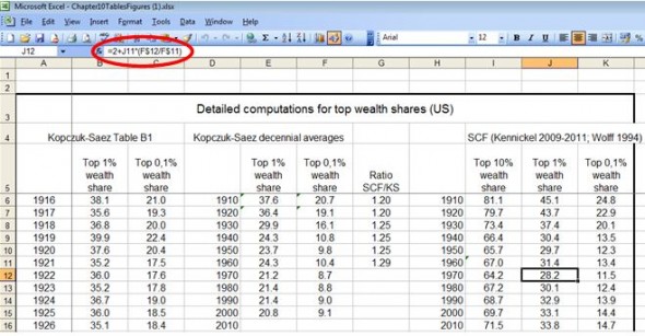
In the US data, Prof Piketty simply adds 2 percentage points to the top 1 per cent wealth share for his estimate of 1970, as you can see that in the screen grab below. The 1970 formula is also interesting as it relates the top 1 per cent wealth estimate in 1970 to the change in a different source’s wealth share of the top 0.1 per cent (column F). This odd assumption is not explained and is possibly a simple excel problem.
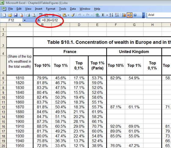
Another example comes from the British data. For 1810 and 1870, Prof. Piketty estimates the wealth share for the top 10 per cent using the share for the top 1 per cent and then adding an arbitrary constant. This constant changes over time. The screen grab below shows that, for 1870, the wealth share for the 10 per cent is equivalent to the top 1 per cent share plus 26 percentage points. For 1810, the constant is 28 percentage points. There is no explanation of these estimates, although a careful reading of prof Piketty’s sources shows that there are actual estimates for these two numbers in the original source. The source number for the top 10 per cent in 1870 (1875 in the original source) is not used, but stands at 76.7 per cent, not the 87.1 per cent in cell F12.
c) Averaging
Prof. Piketty constructs time-series of wealth inequality relative for three European countries: France, Sweden and the UK. He then combines them to obtain a single European estimate. To do so, he uses a simple average. This decision (shown in the screen grab below) is questionable, as it gives every Swedish person roughly seven times the weight of every French or British person. Using an average weighted by population appears more sensible.

d) Constructed data
Because the sources are sketchy, Prof. Piketty often constructs his own data. One example is the data for the top 10 per cent wealth share in the US between 1910 and 1950. None of the sources Prof. Piketty uses contain these numbers, hence he assumes the top 10 per cent wealth share is his estimate for the top 1 per cent share plus 36 percentage points. However, there is no explanation for this number, nor why it should stay constant over time.
There are more such examples. Here’s a list of constructed data, where there appears to be no source or where the source is not described either accurately or fully.
UK
1810 Top 10%
1870 Top 10%
1910 Top 10%
1950 Top 10%
Sweden
1810 Top 10%
France
1920 Top 10% and Top 1%
1970 Top 10% and top 1%
2000 Top 10% and top 1%
US
1810 Top 10% and top 1%
1870 Top 10% and top 1%
1910 Top 10%
1920 Top 10%
1930 Top 10%
1940 Top 10%
1950 Top 10%
1970 Top 10% and top 1%
1980 Top 10% and top 1%
e) Picking the wrong year for comparison

There is no doubt that Prof Piketty’s source data is sketchy. It is difficult to find data that relates to the start of each decade as his graphs demand. So it is only natural that he might say 1908 is a reasonable data point for 1910 on the graph.
It becomes less reasonable when, for example, Prof. Piketty uses data from 1935 Sweden for his 1930 datapoint, when 1930 data exists in his original source material. Nor is it clear why the UK source data for 1938 should equate to 1930 rather than 1940. Nor is it obvious why Swedish 2004 data should be used to represent 2000 (when a datapoint for 2000 exists in the original source), but 2005 data applies to 2010.
f) Problems with definitions
There are different ways to compute wealth data ranging from estimates based on records at death to surveys of the living. These methods are not always comparable.
In the source notes to his spreadsheets, Prof. Piketty says that the wealth data for the countries included in his study are all obtained using the same method.
“Note: as explained in the text, these are for all countries estimates of inequality of net worth between living adults (using mortality multiplier methods)”,
he says, making it clear that the source data comes from estate taxes.
But this does not seem to be true. For the US, he uses the mortality multiplier method until 1950 and it forms a basis for the 1970 numbers, while in 1960 and from 1980 he uses a wealth survey. For theUK, his choices are different. For 2000 and 2010, he bases his estimates on probate data even though the Office for National Statistics has produced a wealth and assets survey.
These inconsistencies are not mentioned in Prof. Piketty’s technical appendix. They can also produce large biases, as I will show in the next section.
g) Cherry-picking data sources
There is little consistency in the way that Prof. Piketty combines different data sources.
Sometimes, as in theUS, he appears to favour cross-sectional surveys of living households rather than estate tax records. For the UK, he tends to avoid cross sectional surveys of living people.
Prof Piketty’s choices are not always the best possible ones. A glaring example is his decision relative to the UK in 2010. The estate tax data Prof. Piketty favours comes with the following health warning.
“[The data] is not a suitable data source for estimating total wealth in the UK, or wealth inequality across the whole of the wealth population; the Wealth and Asset survey is more suitable for those purposes”.
These choices matter: in both the UK and US cases, his decision of which type of data to use has the effect of showing wealth inequality rising, rather than staying constant (US) or falling (UK).
2) Correcting the errors – what difference does it make to the country charts?
If the problems outlined above made trivial differences to Prof Piketty’s final results, there would be little need to worry. But, as this section shows, the combined result of all these problems is to make wealth concentration among the richest in the past 50 years rise artificially.
a) Britain
The problems seem most acute for Britain, where Prof. Piketty shows rising concentrations of wealth among the richest since 1980, when his source data does not. This appears to be the result of swapping between data sources, not following the source notes, misinterpreting the more recent data and exaggerating increases in wealth inequality.
To understand the British data, you must first start with the raw numbers, which come from a variety of sources, outlined in red in the chart below and in this spreadsheet. I have included every year of data that exists, including additional data in the papers Prof Piketty cites, but does not use.

From this chart, I believe you can deduce the following:
- Prof Piketty’s representation of the data (in blue) cannot be supported by the raw data (in red)
- Prof. Piketty’s representation of the 1970s does not match any of the underlying data. All the raw data for the 1970s shows wealth concentrations falling rapidly (by about 10 percentage points). In Prof. Piketty’s representation, however, concentration declines a little (top 10 per cent) and rises a touch (top 1 per cent)
- The level of wealth concentration in Britain in 1980, 1990, 2000 and 2010 is significantly lower than prof Piketty reports.
- Prof. Piketty ends his series taking at face value the level of the HMRC data, despite HMRC saying clearly (see section 1-g) the data is not suited for that purpose, nor is it consistent with the old Inland Revenue Series which Prof. Piketty uses for earlier years. This latter point is also clearly stated in the notes to the source data.
- There seems to be little consistent evidence of any upward trend in wealth inequality of the top 1 per cent. Their wealth share declines from after the first world war to around 1980 and is pretty constant thereafter. The best guess for a consistent series would be a figure close to 20 per cent in 2010. In fact, the ONS Wealth and Assets Survey, which is now three waves old and consistently measures the share of the top 1 per cent has a much lower estimate, at 12.5 per cent, which should be the best current estimate of that wealth share. That is less than half prof Piketty’s estimate.
- There is also little consistent evidence of any upward trend in wealth inequality of the top 10 per cent. Top 10 per cent wealth appears to have fallen from around the time of the first world war until about 1980. There was a gentle rise in the 1990s (largely because of fast-soaring equity prices which are very concentrated among the rich), but inequality then fell again after the millennium and remained stable. My best guess for a number consistent with this data would be around 52 per cent in 2010, but note should again be taken of the ONS data, which is specifically designed to measure wealth. It puts the concentration in the top 10 per cent in each of its three waves at 44 per cent, well below Prof Piketty’s own estimate. The latest ONS wealth survey was published after Capital in the 21st Century, but the first two waves were published in good time and provide the same result.
- There are discontinuities in the raw data which should give anyone pause for thought. Look at the steep change between 1959 and 1960 for the top 1 per cent. And look at the far right of the data (around 2010) for both the 1 per cent and the 10 per cent: the levels of these latest figures are very different from the previous data series. There are also some inconsistencies around 1980 for the top 10 per cent. With such discontinuities, making any long-run time series is fraught with the danger of getting things horribly wrong.
To put the data together in a consistent and simplified form, I get the chart below which includes two options for the 2010 data entry, based on whether one takes not of the ONS Wealth and Assets survey or not. My preference is to use that survey because it is the best data on the whole chart, specifically designed for the purpose of measuring wealth, but I show both results. In each case the tendency for wealth inequalities to rise after 1980 disappears.

b) France
The main problems relating to the French numbers used by Piketty seem to relate to the arbitrary tweaks he uses for 1910 which raises the wealth share at the top around the turn of the 20th century (see 1-b).
The other main difference is that I have taken data for the year in question rather than an average of the data for the rest of the decade. This makes the series more compatible with other countries.
Where the data is missing, for example in 1970, I have not included any point in the chart.

c) Sweden
There appear to be few problems with the choices made by Prof. Piketty for Sweden. These are mostly data omissions, transcription errors and odd choice of data to represent the years in the graph.
For 2010, I use the latest data from 2006, which shows a small decline. Prof. Piketty uses an average of 2005 and 2006, but does not explain why.
He also chose to use 2004 for 2000, when the data point for 2000 was available in the sources he cited. I prefer to stay with the 2000 data.

d) Europe
I constructed a population-weighted European average of Britain, France and Sweden. There is little doubt that as Piketty claims, wealth inequality fell after the First World War and that this fall levelled off after 1980.
But there are two differences between my results and Prof. Piketty’s. The first, more tentative, conclusion is that wealth inequality was not as high at the turn of the 20th century as Piketty says. This result is largely the consequence of giving Sweden a smaller weight in the results than Piketty, reflecting its lower population.
The second, more important, discrepancy is that once more reliable British results are included, there is no sign that wealth inequality in Europe is rising again. The finding that wealth inequality has not been rising in the last 30 years in Europe is a fundamental challenge to Prof. Piketty’s thesis that all advanced economies have been witnessing a turnround in a long historic trend of falling wealth inequality after 1980. The data does not suggest that is true. The two alternative pictures in the graphs represent different choices regarding the UK data for 2010, as discussed in section 2-a.

The US
The US is tricky as the source data is even sketchier than that for the three European countries included in the study. I do not feel comfortable in attempting to create an FT long-term trend as the source data does not allow it.
Instead, I will graph the source data along with Prof. Piketty’s view of the long-term trend, to demonstrate his graph does not seem to be an entirely fair representation of that source data.

Look first at the top lines, representing the share of wealth for the top 10 per cent of the population. There is simply no data between 1870 and 1960. Yet, Prof. Piketty chooses to derive a trend.
The top 1 per cent wealth share has many more data points, including a long-running time series from Kopczuk-Saez (2004). This series gives numbers remarkably similar to those from European data in both level and trend after the Second World War.
In constructing his long-run series (in blue), Prof. Piketty migrates from the Kopczuk-Saez data to that of Wolff (1994, 2010) and Kennickel (2009), even though these are measured on a very different basis. The result is that his line does not have the fall in inequality seen by Kopczuk-Saez but instead shows a rise.
Looking at the two papers by Wolff, which provide estimates from 1960 to 2010, the top 1 per cent wealth share appears to be essentially flat, going from 33.4 per cent of total wealth in 1960 to 34.6 per cent in 2010. Wolff’s papers describe a modest increase in inequality, significantly gentler than Piketty’s graph shows.
3) Put all the wealth data together
When Piketty puts Europe and the US together, he gets the dramatic chart below (figure 10.6 in the book). It shows inequality in Europe dipping below the US after 1960 and an upward trend on both lines thereafter.

As I have noted, even with heroic assumptions, it is not possible to say anything much about the top 10 per cent share between 1870 and 1960, as the data for the US simply does not exist.
There is more data for the top 1 per cent share, but I also do not think it is wise to draw a definitive time series for the US as the data is inconsistent. But one can plot all the individual data and compare it to the European data, as I do in the picture below.
The chart shows that Europe did have higher wealth concentration in the 19th century and that inequality fell more than in theUS. On this Prof. Piketty appears to be right.
The exact level of European inequality in the last fifty years is impossible to determine, as it depends on the sources one uses. However, whichever level one picks, the lines in red in the graph show that – unlike what Prof. Piketty claims – wealth concentration among the richest people has been pretty stable for 50 years in both Europe and theUS.
There is no obvious upward trend. The conclusions of Capital in the 21st century do not appear to be backed by the book’s own sources.
Chris Giles